Michael Fumento
Factual · Powerful · Original · Iconoclastic
James Hansen's Hacks.
August 14, 2007 · Michael Fumento · The American Spectator Online · Climate change
The cover of Newsweek says it all: If you question any aspect of global warming you’re on the take from Big Carbon.
In retrospect, you knew there would be trouble when you put the people responsible for the Space Shuttle program in charge of tracking U.S. temperatures. So perhaps it shouldn’t have come as a big surprise when it was revealed that NASA committed a bit of an oopsie regarding data constantly used by the mainstream media and other global warming proponents.
If you follow the global warming debate, one thing you ”know” is that to even call it a ”debate” is to whisk yourself away to the land of the Flat Earth Society and Holocaust deniers and to be on the take from Big Carbon. Another is that nine of the ten warmest years recorded in the U.S. lower 48 since 1880 have occurred since 1995, with the very hottest being 1998.
Regarding the first, all you need to see is the cover of the current Newsweek, promising to expose ”the well-funded naysayers.” (Discussed in the Aug. 9 TAS.) I know about such smearing firsthand in that there’s a ”fact sheet” on me from a group called EXXONSECRETS.ORG that claims it’s ”documenting ExxonMobil’s funding of climate change skeptics.” Yet I’ve never received a petro-penny from ExxonMobil or anybody in the fossil fuel industry.
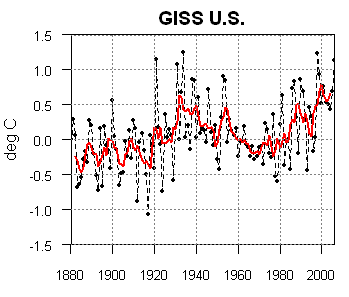
As to the stuff about the hottest years . . . Well, whaddya know! Turns out that’s wrong, too. Figures from NASA’s Goddard Institute for Space Studies (GISS) now show the hottest year since 1880 was 1934. Nineteen-ninety-eight dropped to second, while the third hottest year was way back in 1921. Indeed, four of the 10 hottest years were in the 1930s, while only three were in the past decade.
The real 15 hottest years are spread over seven decades. Eight occurred before the chief ”greenhouse gas,” atmospheric carbon dioxide, began its sharp rise; seven occurred afterwards.
Rush Limbaugh was incorrect in saying the new figures are ”just more evidence” that ”this whole global warming thing is a scientific hoax.” Conversely, global warming hotheads are also wrong in insisting the revelation deserves no more mention than the back of a Trivial Pursuit card. The GISS, which is directed by global warming guru, James Hansen, is saying likewise. He’s wrong. Part of the importance is in the data and part is in how Hansen’s agency behaved, which might be labeled a cover-up.

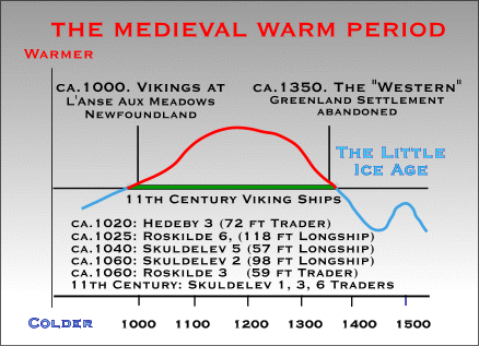
Michael Mann’s infamous "hockey stick graph" simply erased the Medieval Warming Period and the Little Ice Age from history—and the hotheads readily embraced it.
In pooh-poohing the revision, the GISS ignores the tremendous emotional impact it’s had in practically claiming each year is hotter than the one before. Instead it observes (correctly) since the U.S. accounts for merely two percent of global land surface, a relatively small adjustment in its figures doesn’t meaningfully impact the global picture.
But, notes Canadian mathematician Stephen McIntyre, who exposed the false figures, ”The Hansen error . . . has a significant impact on the GISS estimate of U.S. temperature history . . .” (Emphasis added.) Is this important because we’re a major world power or that we produce the best fried chicken? No, it’s important because we have a far more sophisticated system of temperature monitoring than countries with far larger land masses. Hence, data from each of these nations affect the global model more than the American data.
”Many of the stations in China, Indonesia, Brazil and elsewhere are in urban areas (such as Shanghai or Beijing),” observes McIntyre. This can produce hotter temperatures, yet some of the major trackers of the data from these countries, including the National Oceanic and Atmosphere Administration, make no attempt to adjust for monitor placement errors. In any event, for some reason ”the U.S. history has a rather minimal (warming) trend if any since the 1930s, while the ROW [rest of the world] has a very pronounced trend since the 1930s.
Thus if the U.S. model, by far the most accurate one, became the model, it would be a gut punch to those claiming we must take drastic, horrifically expense measures right now to ameliorate warming.
Therefore, for the GISS to say this ”only” affects the U.S. data is rather like a used car salesman insisting, ”This automobile defect is trivial; it only affects steering and braking.”
Then there’s the whole issue of how the revised data came about and came to light.

The adjusted chart (courtesy of Stephen McIntyre) of the GISS mean U.S. temperatures shows little of a warming trend since the 1930s, yet atmospheric carbon dioxide has increased tremendously since then.
Perhaps you noticed that in writing ”it was revealed” I appear to have violated a cardinal rule of grammar in using the passive voice right there in the first paragraph where my third grade teacher couldn’t possibly miss it. This was actually dramatic foreshadowing because, you see, NASA didn’t change the figures without being pushed and once it did it refused to publicize them.
McIntyre was already hated by the hotheads for debunking the infamous ”hockey stick” graph promulgated by University of Virginia geoscientist Michael Mann and colleagues beginning in the late 1990s. Mann’s calculations, using new imputs, showed temperatures to be flat over the last thousand years like a hockey stick shaft before suddenly angling up like the blade in the last half of the 20th Century.
This statistically wiped out both the Medieval Warming Period (c. 900-1300), which unleashed the Vikings, and Little Ice Age (c. 1250-1850), even though historical information for both is overwhelming. Yet the highly-politicized Intergovernmental Panel on Climate Change (IPCC) eagerly adopted the hockey stick graph in its 2001 Assessment Report. But then McIntyre and fellow Canadian economist Ross McKitrick showed Mann’s methodology produces hockey-stick shapes even when applied to random data — bringing back those scary Scandinavians and ice-skating on the Thames.
McIntyre’s latest debunking was the discovery of an error in GISS records for the years 2000 through 2006. In simplest terms, they hadn’t been adjusted to compensate for the location or time of day where the data was gathered.
But nobody correlated those newer figures with the older ones until McIntyre did, even though later Hansen admitted it was ”easy to fix.” McIntyre published the data on his own website (which is currently down because it’s overloaded with traffic) and got the agency to admit it was wrong and post new figures. It even sent him a thank you note.
Yet the GISS did absolutely nothing to alert scientists or the public to the new figures. This though it has published five global warming press releases so far this year, each one alarming. It took the blogosphere and radio talk show hosts to publicize the new figures even as the mainstream media essentially ignored it. (The Washington Post finally ran an article a week after the controversy began, siding with the GISS and describing McIntyre as nothing more than a ”blogger.” All the presidential candidates have blog sites, but somehow the Post refrains from tagging them as bloggers.)
Ultimately the greatest importance of all of this is that it strongly appears to substantiate the intuitive belief that, with scientist-politician Hansen at the helm the GISS, whose data are far more important to modeling global temperatures than it lets on, is not a neutral collector and disseminator of statistics but rather a politicized mouthpiece.
